. .
  • Home
  • About
  • Shop
  • Blog
  • Home
  • About
  • Shop
  • Blog
  • Let Me Finish

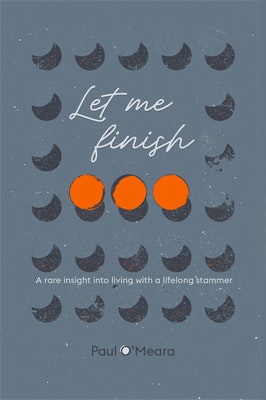
    This is my book cover for a memoir centred around living with a stammer.

    At the outset I was keen to do a more illustrative picture, but this more design-led image ended up being a better fit. As a self-published book, this was very much a collaborative effort, with the author Paul O'Meara involved at every stage of the design process. I think the ellipsis are a neat solution to representing a stammer visually, hopefully more subtle than using a wincingly obvious image such as a pad-locked mouth.

    Anyway, hopefully the image does the content justice. It's not just a book for those with a stammer or speech impediment, it helps raise awareness amongst those unhindered by communication problems, about the various issues that can be encountered in the daily lives of stammerers.

    To find out more about the book then explore Paul's website here, or follow his twitter for more updates. You can buy the book, in paper or ebook format, via Amazon.

    More

  • Blake at the British Library

    Recently a kid in class asked me why I wasn't as famous as Quentin Blake. I'm not as good, was my initial reply, but then not wanting to squish the compliment I noted that Blake is a lot older than me so maybe I will be by the time I'm his age. If anyone overheard, I'm not as delusional as that sounds. Of course, my style owes plenty to Blake, especially when drawing at speed or intuitively. Unsurprisingly, as I often copied his pictures from my Roald Dahl books growing up. Replicating them mark by mark with colouring pencils; perhaps missing the point of the lovely loose expressions of his squiggles and blots, but never mind, I'm sure those efforts helped me able to give simple expression to characters.
    If you pop in to the British Library, you will find a corner currently given over to some new portraits of Dahl characters by the master illustrator. I never can resist the chance to see his work up close. Something about seeing the actual ink splats, marks and lines up close that I'll never tire of. The reminder of childhood. Looking at them with my 6 month old daughter made me eager for the day we can read the books together.
    I couldn't tell you my favourite Dahl book any more than I could tell you my favourite song, but these new portraits bring them all to life again. As Blake says in his introduction, they have been treated here as if they are real people - which to many of us they are.

    More

  • MYA Project

    Here is the artwork I produced for the LP release of Italian artist MYA Project. The music is available to listen to here, described as alternative electronic/acoustic pop.Please purchase and support independent music if you like what you hear. This debut release is on Milky Bomb Records, for whom I previously created the artworkfor their compilation LP.Creating an image that should somehow represents a sound can be difficult, trying to retain a sense of your own style but still complimenting the artist and the music. And you never really know if you're successful or not.

    More

  • Know Thyself

    All sorts of oddities in the current exhibition at the Wellcome Collection; a stuffed badger curled in the corner without explanation, video of Ming the tiger who lived in a New York apartment, the bill of a platypus ripped off in disbelief, diagrams of a dinner held in a Crystal Palace dinosaur, a 3D printed extinct lion's skull, various taxidermy efforts and dioramas.
    I could go on, and maybe I should, because there were lots of lists, catalogues, and encyclopedias. The first edition of Carl Linnaeus' aesthetically pleasing Systema Natura was on display.
    Also lots of lovely old illustrations and artefacts throughout to pore over.
    A video installation of a modern fable narrated by an endangered amazon parrot, connecting the Big Bang, Om, the Great Silence and man's search for intelligent life in outer space via the Arecibo Observatory summed up the exhibition. Both were oddly profound, poetic, intriguing and inspiring.

    More

  • Read, Drawn & Posted

    At some point last year I started to draw the author of each book I finished reading. A reason to draw more faces and a record of my reading habits. Might be interesting to see the variety, or not, of my habits. Usually I have no idea what the authors look like, searching for their image can change my perceptions in the same way as finally meeting someone only previously encountered on the phone. You don't look like the face your voice painted in my head, I often think.

    No hiding of any garbage I read, similarly no edits or re-drawing and no discarding. These are quick doodles. Surnames removed when posting on Instagram, the idea not to be cartoon, caricature or realistic portraits of great likeness. Just faces*. Some are simply bad drawings; hopefully the better examples will hide the weaker ones rather than the converse. Part of the process, for me, is to see what works about the faces I draw and why.

    The first 16 are above. Quite a few big hitters there, (Orwell, Nabokov and Greene). Looks like I stick to what I know the older I get. Either a worrying sign of growing conservatism or an admirable display of ever more discerning taste.

    I don't expect anyone else to be that interested in what I've read, but I would be interested if other people did the same thing (illustrator or not). It could be like a survey done in a world where doodling book worms are forced to work in the National Statistics office, and we can extrapolate data like 'ooh, there's someone else who has read that book' and 'Kenneth Grahame is surprisingly tricky to draw'. It probably needs a hashtag, but that's basically admin so I'll leave that until the unlikely event of someone joining me with this idea.


    *I've left in the book titles, so the curious can find out who they are, as well as often giving the drawings an accidentally enigmatic title.

    More

  • Zaha Hadid

    Of course I love Zaha Hadid's buildings - I used to work opposite the Olympic Aquatics Centre in Stratford and the Evelyn Grace Academy is in my Brixton neighbourhood - but since becoming aware of her drawings and paintings via a documentary, I've been eager for the chance to see them. The Hadid-designed Serpentine Slacker gallery gives this chance.

    Her thought process can be followed from the small sketchbooks to vast canvases on display. Semi-representational but essentially abstract images that might be hard to process without the insight of her prep work and the completed visions of her architecture.
    Endless curved lines and harmoniously scattered blocks of colour. Like plans for a future that never happened. The influence of Constructivism taken to more beautiful places. A piece called London 2066 (shown above, from 1991) looks like a gloriously updated version of the EastEnders titles, with a Vangelis theme tune.

    The artworks are the buildings deconstructed, floating and swirling but paused - the VR of 4 of the piecesdeconstruct the paintings themselves and the over-lapping formations come alive. I would've liked the option to choose various audio tracks. I wonder how different it would feel experiencing the visuals with doom-laden music or cheerful summer sounds, for example.

    Difficult not to be inspired by the flood of ideas that seem to have poured from Zaha Hadid.

    More

  • A Dul Moment

    I recently designed the masthead for newly established local blog In Dulwich, adapted from the square version above. The site has a loose remit, often musing on anything vaguely connected to the South London area, with a (blurred) focus on drinking. Ranging from a brief video guide to Marrakech, climate change information and local news tit-bits, this scatter gun approach is an antidote to the niche, demographically precise, argument reenforcing echo chambers we all apparently inhabit on the web these days. As they share an office with me, I do occasionally pop up; funnily enough usually when a tasting happens to be going on. Follow them on Twitter to avoid missing out on any future appearances and also to see an alternatively coloured version of my artwork.

    More

  • Merry Christmas!

    Here is a sort of minimalist design of mine, based on the popular carol 12 Days of Christmas, and a reason to say Merry Christmas.

    Not knowing the words by heart, I looked them up to discover just how many different versions there are. New items are introduced, wording altered and for no apparent reason the amounts of certain gifts are switched about a bit. This happens more towards the end of the song, as the mind wanders or the memory fails. It is a pretty boring song to sit through in it's entirety.

    Being a traditional sort of chap, I went with the earliest recorded version as my guide.
    I can see how pipers and drummers are interchangeable, and why an ancient term for Blackbirds 'Colly' morphed into 'calling', but not the inclusion of badgers baiting. Apart from being an unsuitable gift, badgers are usually baited not baiting, I think.

    Hopefully this is a useful (and pleasant to look at) cue sheet if you find yourself starting a rendition. Merry Christmas!

    More

  • 1
  • 2
  • 3
  • Twitter
  • Instagram
  • Email

© 2022 Sam Le Mort. All rights reserved. No part of this website may be reproduced without permission.